TYPOGRAPHY (TASK 1): Exercises
–––
23/09/2024 - 28/10/2024 (Week 1 - Week 5)
Irdhina binti Mazli Sham (0366894)
Typography - Bachelor of Design in Creative Media - Taylors University
Task 1 Exercises
TABLE OF CONTENTS:
LECTURES
WEEK 1
- Lecture: Typo_0_Eportfolio Briefing
- Tutorial on how to set up eportfolio
- Lecture: Typo_1_Development
- Sources mainly from Kane. J. (2002) A Type Primer by Lawrence King (UK)
- from perspective of the West (tends to overlook Asia)
EARLY LETTERFORM DEVELOPMENT [PHOENICIAN TO ROMAN]
- INITIALLY: scratched into wet clay (sticks), carved into stone (chisel)
- see uppercase form evolve (only letterform for 2000 years)
- lines + circles

|
|
Fig. 1.1. Letterform development |
**while Phoenicians and Sematics wrote
from right to left, the Greeks wrote in
changing direction and orientation –
"BOUSTROPHEDON" (how the ox ploughs)

|
| Fig. 1.2. Boustrophedon |
HANDSCRIPTS (3RD TO 10TH CENTURY C.E.)
- Square Capitals
- found on ROMAN MONUMENTS
- reed pen at 60º – varying strokes
- contains serifs
- Rustic Capitals
- compressed versions of SQUARE CAPITALS
- fit more words, less time taken
- slightly hard to read due to compression
- pragmatic
- Cursive Form
- everyday transactions
- simplified for speed
- beginning of LOWERCASE LETTERFORM
- Uncials
- incorporated some ROMAN CURSIVE (A, D, E, H, M, U, Q)
- Latin for "12th of anything"
- may refer to one inch high letters (12 in = 1 ft)
- small letters (broad form easier to read than RUSTIC CAPITALS
- Half-Uncials
- formalisation of CURSIVE FORM
- formal beginning of LOWERCASE LETTERFORM
- 2000 years after Phoenicians
- Standardisation of Ecclesiastical Text
- task given to ALCUIN OF YORK by CHARLEMAGNE (789)
- used majuscule, minuscule, capitalisation, punctuation
- standard calligraphy for a century
BLACKLETTER TO GUTENBURG'S TYPE
[regional variations of ALCUIN'S script]
- NORTHERN EUROPE [Blackletter/Textura]
- condense, strongly vertical
- SOUTH [Rotunda]
- rounder, open-hand
- ITALY [Humanistic script]
- based on ALCUIN'S minuscule
- GUTENBURG? includes engineering, metalsmithing and chemistry
- built pages mimicking scribes' hand [Blackletter]
- different brass matrix/negative impression for each letterform
TEXT TYPE CLASSIFICATION
[prevailing technology, commercial
needs, aesthetic trends]

|
|
Fig. 1.3. Text type classification types |
CHRONOLOGY:
BLACKLETTER/MEDIEVAUX (1450) -
OLDSTYLE (1475) - ITALICS (1500) -
SCRIPT/ÉCRITURES (1550) -
TRANSITIONAL/TRANSITIONNELS (1750) -
MODERN/BODONIENS (1775) -
SQUARE/SLAB SERIF (1825) -
SANS SERIF/LINÉAIRES (1900) -
SERIF + SANS SERIF (1990)
- 1450 BLACKLETTER
- based on hand copying styles for books in Northern Europe
- 1475 OLDSTYLE
- lowercase by Italian humanist scholars (based on 9th century Caroline minuscule)
- uppercase on Roman ruins
- evolved away from origin over 200 years (migrate from Italy to England)
- 1500 ITALIC
- condensed and close-set
- soon complement Roman forms (since 16th century)
- 1550 SCRIPT
- replicate engraved calligraphy
- not appropriate for lengthy text
- from FORMAL/TRADITIONAL to CASUAL/CONTEMPORARY
- 1750 TRANSITIONAL
- refinement of OLDSTYLE
- due to advances in casting and printing
- exaggerate thick and thin, brackets lightened
- 1775 MODERN
- further rationalisation of OLDSTYLE
- unbracketed serifs, extreme thick/thin contrast
- 1825 SQUARE SERIF/SLAB SERIF
- originally heavily bracketed serifs, little variation of thick/thin
- commercial printing for advertising-heavy type
- remove brackets when evolved
- 1900 SANS SERIF
- remove serifs
- first intro by WILLIAM CASLON IV (1816)
- wide spread from 12th century
- vary towards HUMANIST (Gill Sans) or RIGIDLY GEOMETRIC (Futura)
- referred to as grotesque and Gothic
- 1990 SERIF + SANS SERIF
- include both serifs and sans serifs
- also include stages in between the two
- Lecture: Typo_2_Basic
- DESCRIBING LETTERFORM - specific parts of a letterform

|
|
Fig. 2.1. Anatomy of letterform diagram |
- Baseline
- base
- Median
- define x-height
- x-height: height of any typeface of lowercase 'x'
- Apex (UP) / Vertex (DOWN)
- point made when two diagonal lines are joined
- Arm
- short strokes from stem
- horizontal (E,F,L)
- inclined upwards (K,Y)
- Ascender
- portion of stem above median
- applies to LOWERCASE
- Barb
- half-serif finish on curved strokes
- ex. C, G, S
- if on horizontal arm, it is a beak
- Bowl
- round form describing counter
- can be opened/closed
- Bracket
- transition between serif and stem
- Cross Bar
- connect two stem
- if horizontal bar on 'f' / 't', it is a cross stroke
- Crotch
- space where two strokes meet
- Descender
- part of stem below baseline
- Ear
- extends from stem/main
- Em/En
- Em is equal to current font size
- 1 em = 2 en
- Finial
- tapered/curved end
- ex. 'e' , 'c'
- Leg
- lower angled strokes
- ex. 'K' , 'Q' , 'R'
- Ligature
- two separate letters merged into a single shape
- formed by combs
- Link
- short stroke connecting top and bottom bowls of lowercase 'g'
- Shoulder
- curved stroke from stem
- Loop
- (partially) enclosed counter below baseline
- connected to the bowl by a link
- seen in cursive ('p' , 'b' , 'l') and double-storey 'g'
- Spine
- main curved stroke
- vertical or horizontal (common)
- Spur
- small protruding part off main stroke
- often where a curve meets a straight line
- Stem
- main vertical/diagonal stroke
- Stress
- orientation determined by thin strokes (curves)
- Swash
- typographical flourish
- Tail
- decorative curved descender
- capital 'Q' , 'R' , 'K'
- descender of lowercase:
- 'g' , 'j' , 'p' , 'p' , 'q' , 'y'
- Terminal
- self-contained fin of stroke
- THE FONT
- full font of typeface has more than 26 letters
- TYPE FAMILY: many faces (album)
- TYPE FACE: individual weight (song)
- choose good range for designing
- UPPERCASE
- capital letters
- includes accented vowels, c cedilla, n tilde, a/e and o/e ligature
- LOWERCASE
- minuscule
- SMALL CAPITALS
- found in serif fonts (expert set)
- uppercase reaching x-height
- used in acronyms
- cannot be artificially generated (changes thickness)
- UPPERCASE NUMERALS
- "Lining Figures"
- same height as uppercase letters
- same kerning width
- used with tabular material/uppercase letters
- LOWERCASE NUMERALS
- "Old Style Figures" // "Text Figure"
- set to x-height with ascender/descender
- best used with both uppercase and lowercase letterform
- less common sans serif
- ITALIC
- refer back to 15th century Italian cursive
- available in most fonts
- roman form of italics is oblique
- PUNCTUATION // MISCELLANEOUS CHARACTERS
- ex. !@#$%^&
- miscellaneous characters change from typeface to typeface
- ORNAMENTS
- flourish in invitation/certificate
- available in larger typeface family
- ex. Adobe Caslon Pro
- DESCRIBING TYPEFACES
- Roman
- uppercase from inscriptions of Roman monuments
- slightly lighter stroke in Roman is book
- italic for Roman is oblique
- italic is handwriting based
- Boldface
- thicker than Roman
- "semibold", "medium", "black", "extra bold", "super"
- for some, boldest rendition is poster
- Light
- lighter than Roman
- even lighter is thin
- Condense
- extreme is compressed
- Extended
- extended variation of Roman
WEEK 2
- Lecture: Typo_3_Text_P1
- text information
- TEXT/TRACKING: KERNING AND LETTERSPACING
- Kerning: automatic adjustment of space between letters
- Letterspacing: adding space between letters (addition/removal of a space is called tracking - combo)
- KERNING ≠ LETTERSPACING
- decrease readability if given too much tracking (especially in long text)
- DO NOT LETTERSPACE LOWERCASE (no no)
- uppercase are able to stand on their own
- lowercase require counterform (space) between letters to maintain the line of reading
|
|
|
Fig. 3.1, 3.2. Diagrams of kerning |
- TEXT FORMATTING
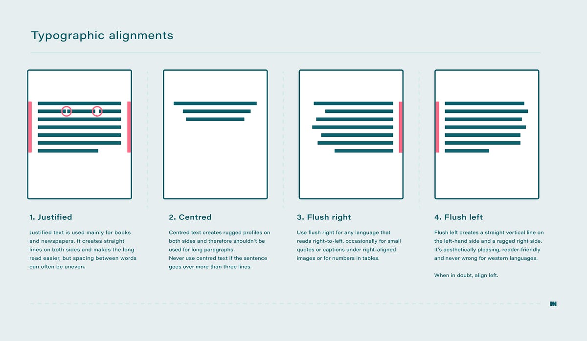
- FLUSH LEFT
- closely mirrors asymmetrical experience of handwriting
- LINE: starts same point, ends on whatever last word [FLUSH LEFT, RAGGED RIGHT]
- consistent spacing between words - creates even gray value
- GRAY VALUE: text on a white page (too dark: too much leading/kerning, too light: vice versa)
- CENTERED
- symmetrical
- equal value/weight to both ends of any line
- transforms fields of text into shapes - adding pictorial quality
- IMPORTANT: amend line breaks to prevent overly jagged look
- CENTERED, RAGGED RIGHT AND LEFT
- USE SPARINGLY - NOT FOR LONG TEXT
- FLUSH RIGHT
- places emphasis on the end of a line
- use for relationship between text and image might be ambiguous without a strong right orientation
- ex: captions, axial layout
- FLUSH RIGHT, RAGGED LEFT
- USE SPARINGLY - NOT FOR LONG TEXT (unless Arabic/Jawi)
- JUSTIFY
- symmetrical
- produce 'rivers' of white space running vertically through the text
- use line breaks and hyphenation to amend
- not always the best choice (better left-aligned)
- NOTE: PRIORITISE THE WORDS RATHER THAN THE TYPE. If you notice the type/font before the actual words, CHANGE! depends on context.
- TEXTURE
- text should occupy the page just as much as image
- TYPE SIZE
- large enough to be easily read (imagine a book in your lap)
- LEADING
- encourages vertical eye movement if set too tight (easily lose place)
- creates striped patterns if set too loose (distracts reader)
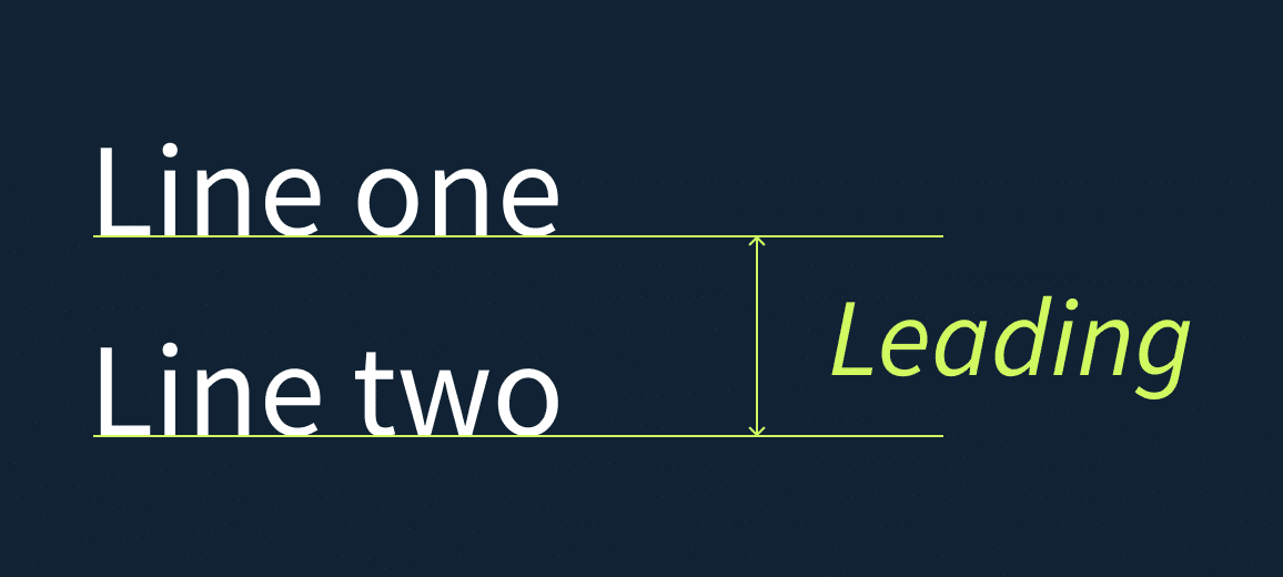
|
|
Fig. 3.4. Leading |
- LINE LENGTH
- shorter lines = less leading
- RULE OF THUMB: keep between 55-65 characters
- too long or too short line lengths impairs reading
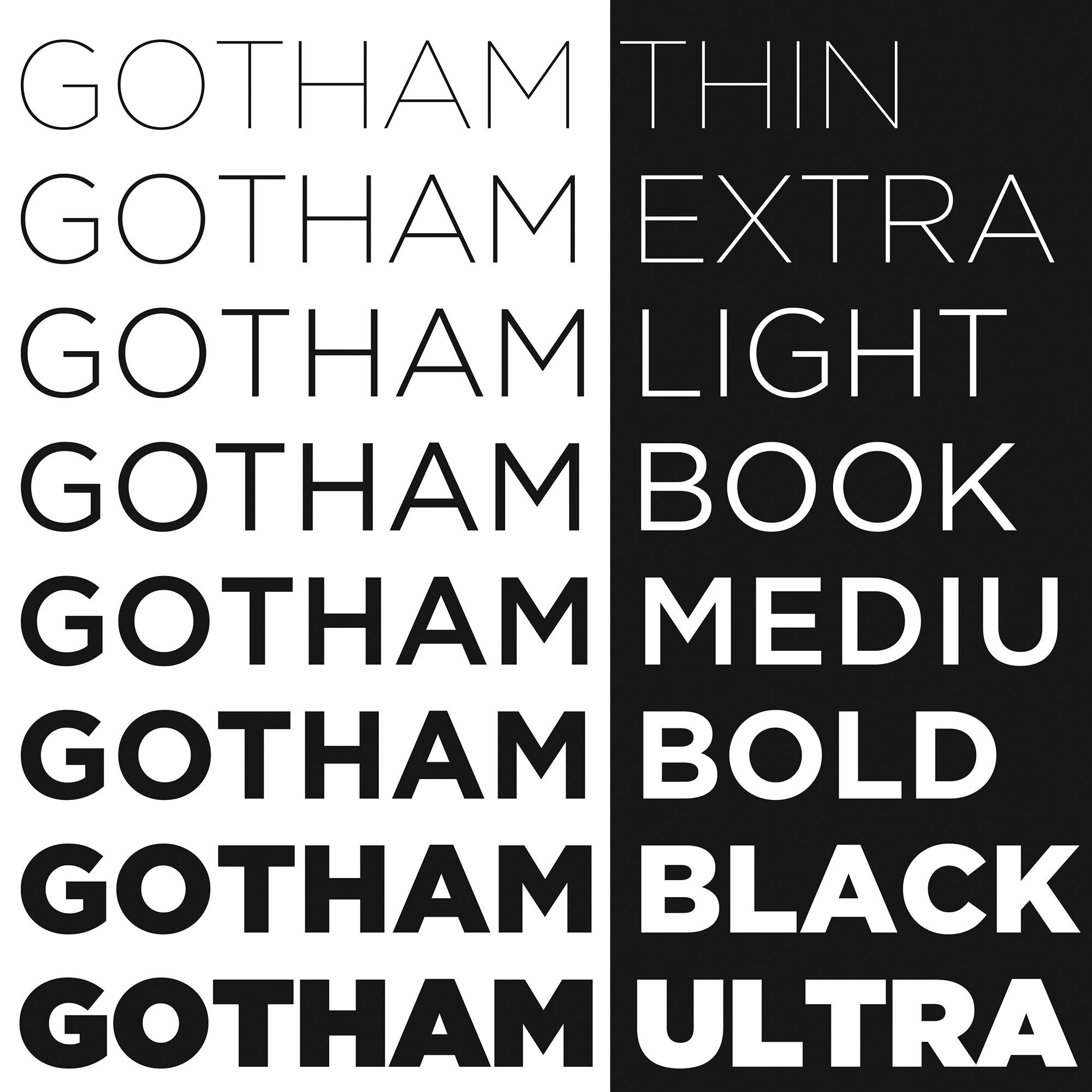
- TYPE SPECIMEN BOOK
- samples of typefaces in different sizes
- used based on final outcome (on screen or printed)
- used to make a responsible choice of type (provides accurate reference)
- consists of type, type size, type leading, type line length etc
- COMPOSITIONAL REQUIREMENT:
- creates a field occupying a page/screen
- think of having middle gray value (ideal)
- enlarge type to 400% on screen
- see clearly relationship between descenders on one line and ascenders on the line below
|
|
Fig. 3.5. Type Specimen Book of Gotham |
- Lecture: Typo_4_Text_P2
- INDICATING PARAGRAPHS
- pilcrow (¶)
- from medieval manuscript
- line space (leading) between paragraphs
- ensures cross-alignment across columns of text (maintains good reading rhythm)
- [**leading should be 2-3 pts more than type size]
- INDESIGN: press pilcrow, will have options to adjust
- line space = height between descender of one line and another
- leading = height between descender of above line and ascender of below line
- standard indentation
- indent size = line spacing size = text size
- save space and cram information - usually in newspaper
- USE INDENT, USE JUSTIFY
- extended paragraphs
- creates wide columns of text
- chosen for strong compositional/functional reasons
- WIDOWS AND ORPHANS – A V O I D !!!!
- unpardonable gaffes, designers avoid
- WIDOW: short line of text left alone (end of column)
- ORPHAN: short line of text left alone (start of column)
- flush right text is more forgiving towards widows but not orphans
- widows and orphans are serious gaffes in justified text
- FIX WIDOWS: rebreak (shift + enter) line endings (avoid last line being noticeably short)
- FIX ORPHANS: no column starts with last line of preceding paragraph

|
|
Fig. 4.1. Examples of Orphans and Widows |
- HIGHLIGHTING TEXT
- using italics, bold, changing typeface, colour of text
- if colour of body text: only use CMYK (except yellow)
- if change typeface: might change text size (san serif typically larger in size than serif) – follow x-height (reduce by 0.5 pts)
- reduce aligned figures or all capitals acronym by .5 - ensure visual cohesion
- can also highlight by placing colour on the back of the text
- sometimes necessary to place typographic elements outside left margin of column
- maintain strong reading axis
- quotation marks - can create clear indent
- quotation marks are slanted
- quotation mark ≠ prime mark
- HEADLINE WITHIN TEXT
- A head
- clear break between topics within a section
- B head
- subordinate to A heads
- indicate supporting argument/paragraph or example
- do not interrupt text as strong as A heads
- C head
- not common
- highlights specific materials within B head
- do not interrupt reading flow
- followed by an em space (two space) for visual separation
- CROSS ALIGNMENT
- reinforces architectural sense of the page
- articulates the complimentary vertical rhythm
- one line can cross align with two lines of another text type (works with any number, consistent)
- double leading space to maintain cross alignment
WEEK 4
- Lecture: Typo_5_Understanding
- Letters // Understanding Letterforms
- BASKERVILLE: uppercase A may look symmetrical but...
- has two different stroke weight
- each bracket connecting to the serif to the stem has its own unique arc
- UNIVERS: uppercase A may look symmetrical but...
- different width of strokes (left thinner than right)
- both Baskerville and Univers are harmonious and expressive
- may contribute to dynamic
- lowercase 'a' HELVETICA vs. UNIVERS
- how stems finish and meets the bowls can reveal a difference between these two fonts
- maintaining x-height
- HOWEVER, curved strokes must rise above median or sink below baseline
- appear same size as the other letters
- "lesser real-estate"
- Letters //Form // Counterform
- when letters join to form words, counterform includes the spaces between them
- to understand form and counterform, analyse the typeface closely to get greater detail
- helps when creating own fonts
- understand weight of strokes
- Contrast
- directly applied to typography
- many variation; small and organic // large and machined etc
- helps in interpreting information (importance)
WEEK 5
- Lecture: Typo_6_Screen&Print
- Different Medium
- screen-based technology – people back then predicted use of paper would decrease (instead increased due to invention of printers)
- debate of using e-book or physical books
- developmental effect of not using touch and feel sensation (pascaindera)
- happens if overly exposed to screens as children
- may affect communication skills
- typography still exists in all forms and shapes
- past: living only when it reached paper
- good typography/readability is a result of skilled typesetters and designers
- now no longer rigidly controlled - experimentation of type design on websites used to be restricted in look and feel (going outside requires a lot of coding and skill)
- Print Type vs. Screen Type
- TYPE FOR PRINT: intended for reading
- designers ensure text is smooth/flowing/pleasant to read
- good typeface: Caslon, Garamond, Baskerville etc – elegant and intellectual but highly readable at a small size
- versatile, easy-to-digest classic typeface
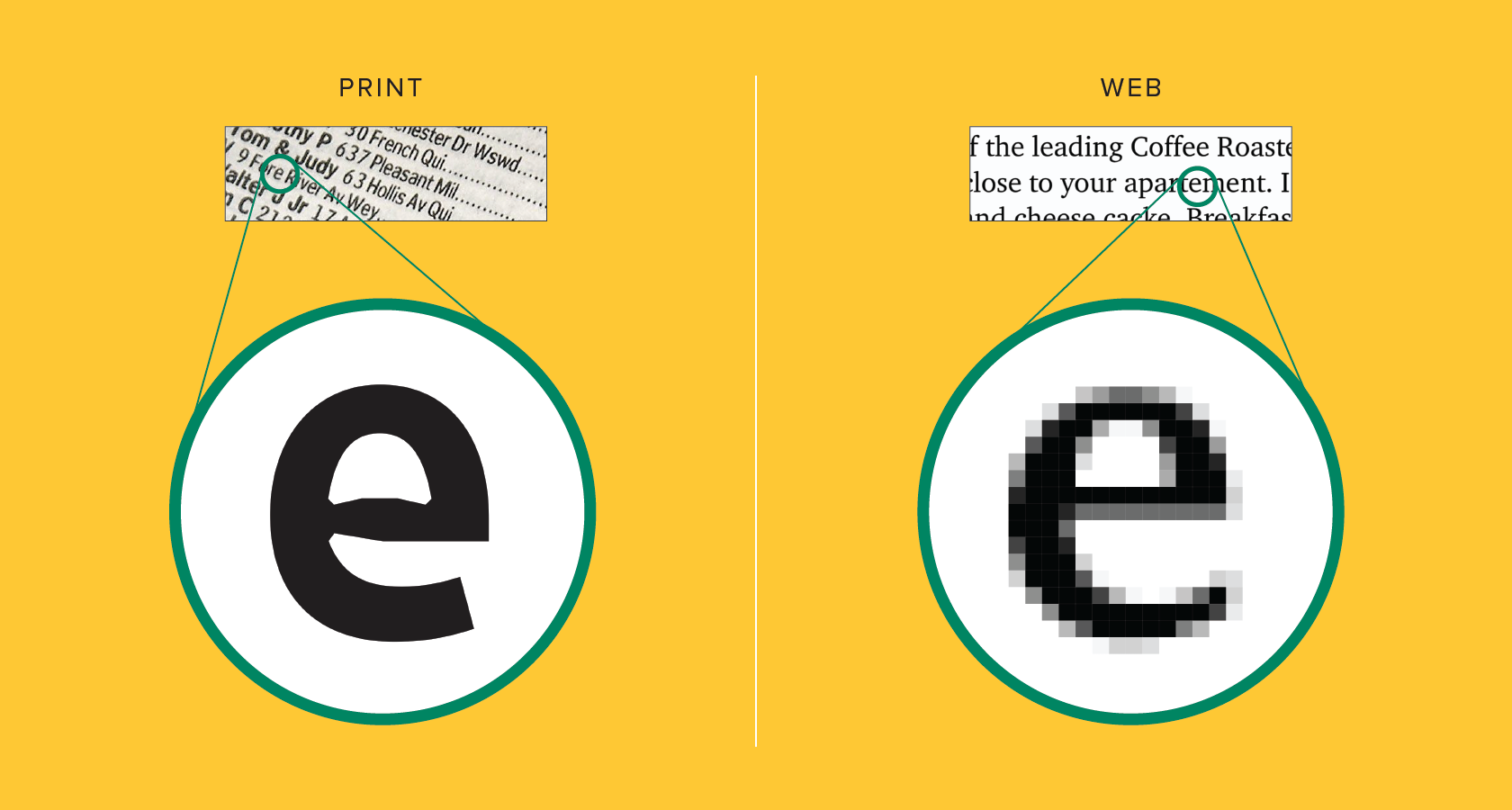
- TYPE FOR SCREEN: optimised and modified to enhance readability and performance onscreen
- including change in x-height, letterforms, open counters, thin strokes/serifs, stroke contrast, curves, angles
- typefaces designed specifically for screen: Verdana, Georgia
- important adjustment: more open spacing
- changes may improve character recognition and overall readability
- in screens including the web, e-books, e-readers, mobile devices
|
|
Fig. 6.1. Comparison between text on paper vs text on screen |
- HYPERLINK
- jump to other document/section within current document
- exists in the form of a word, phrase or image
- FONT SIZE FOR SCREEN
- 16-pixel text on screen = same as text printed
- accounting reading distance – people read books pretty close
- typically set at about 10 points (read a few inches away)
- at least 12 points (read at arm's length)
- 12 pts on print = 16 px on screen
- SYSTEM FONTS FOR SCREEN/WEB SAFE FONTS
- each device has pre-installed font selection based on its operating system
- if a reader does not have a specific (non web-friendly) font used in a website, the text would revert to its basic variation (ex. Times New Roman) – reader will not be notified of font change
- now web safe fonts appear across all operating systems
- overlap Windows to Mac to Google
- ex. Helvetica, Georgia, Garamond, Courier New
- PIXEL DIFFERENTIAL BETWEEN DEVICES
- 100 pixels on a laptop ≠ 100 pixels on a big 60" HDTV
- different size and proportion for each device
- **table below may be outdated

|
|
|
- STATIC VS. MOTION
- does not determine dynamism
- STATIC: minimal characteristics in expressing words
- traditional characteristics (ex. bold, italic)
- used in variation (ex. billboards, posters, fliers)
- informational/promotional/formal/aspirational
- MOTION: temporal media
- dramatise type, become fluid/kinetic
- used in film title credits – bring to life through animation
- overlayed onto music videos and advertisement
- set in motion of a rhythm
- expressive to help establish tone or express value
- prepares the audience by evoking a certain mood
- example: Seven (movie)

|
|
Fig. 6.3. the movie Seven (1995) |
INSTRUCTIONS
- Module Information
PROCESS WORK
TYPE EXPRESSION
RESEARCH
The four words chosen by our class were melt, grow, fade and
burn. Due to the simplistic nature of the words, I tried going for a
different approach; using different definitions of the same word. Moreover,
I tried to expand in context of idioms accompanied by the chosen words such
as growing out of one's shell.

|
|
Fig. 7.1. Definition of grow |

|
|
Fig. 7.2. Definition of fade |

|
|
Fig. 7.3. Definition of melt |

|
| Fig. 7.4. Definition of burn |
IDEATION
INITIAL SKETCHES:
In terms of ideation, I started by going for a direct approach, that is
forming the words based on specific shapes/objects. To make it more
interesting, I tried adding variety to the objects (ex. burn: campfire
stories, torch, spark, scars) in order to establish better designs.
Fig. 8.2, 8.3, 8.4, 8.5. Notebook pages of initial sketches
(3.10.2024)
FINAL SKETCHES:
Fig. 8.5, 8.6, 8.7, 8.8. Final sketches of the four words
(3.10.2024)
DIGITISATION:
I started approaching digitisation by looking through the ten fonts
given by Mr. Vinod. In the end, I decided to use
Gill Sans, Univers and ITC New Baskerville for melt, fade and
grow respectively. I also reused Gill Sans for burn but
instead of a white background, a black background was used as per Mr.
Max's suggestion. According to Mr. Max, this would assist in giving
the word a glowing effect, which I agree upon further development.
Gradients with different starting/ending points were also applied to
each letter to give the illusion of layers.
As for the others, melt was finalised after several trial and error with
different designs. Fade consists of each letter being designed to look
like they are increasing in speed and therefore decreasing in opacity.
Finally, I decided to go for a serif font when digitising grow due to
its varying contrast in strokes.
ANIMATION:
For the following task, we were required to create a gif
illustrating one of the chosen words. Although the task states
only one animation would suffice, I decided to do two using the
words fade and grow with the former having
a lot more frames than the latter.
ANIMATIONS:

|
|
Fig. 8.15. GIF animation of grow |

|
|
Fig. 8.16. GIF animation of fade [FINAL] |
TEXT FORMATTING
KERNING/TRACkING
Text formatting consists of using kerning and letter spacing to improve the
text appearance. As an exercise, we are required to type our own names using
the ten different typefaces with varying fonts provided.

|
| Fig. 8.17. Irdhina in 10 different fonts |
LAYOUTS
After completing the kerning/tracking exercise, Mr. Max guided us in
creating layouts for "I am Helvetica" text. We are required to produce six
different layouts and have one chosen by Mr. Max.

|
|
Fig. 8.18. Progress screenshot |

|
|
|

|
|
|
I ended up with nine different layouts to better experiment with different functions on Indesign.
FINAL OUTCOME:
FINAL TEXT FORMATTING LAYOUT
HEAD LINE
Typeface: Bembo Std
Font/s: Bembo Std Bold
Type Size/s: 72 pt
Leading: 86.4 pt
Paragraph spacing: 0
BODY
Typeface: Bembo Std
Font/s: Bembo Std Regular
Type Size/s: 9 pt
Leading: 11 pt
Paragraph spacing: 11 pt
Characters per-line: 54
Alignment: left justified
Margins: 12 mm
Column: 2
Gutter: 5 mm
 |
Fig. 8.22. Final layout without grids |
FEEDBACK
WEEK 1
Introduction to Typography and briefing for eportfolio. Link to eportfolio
is made with the first post for task 1 (exercises). Four words were
chosen; burn, grow, fade, melt.
WEEK 2
Four designs per word (total 16 designs) were made and later on approved by
Mr. Max, who previously showed several shortcuts for Adobe
Illustrator.
WEEK 3
General Feedback: Digitisation of the four words was made with
a few tweaks made to further improve each appearance.
Specific Feedback: Design for burn was inverted with added
gradient (black background, disappearing word) following Mr. Max's
suggestion. Melt was also redesigned to give better emphasis on the word
itself.
WEEK 4
General Feedback: Animation for one chosen word was made. I decided to animate two words; grow and fade.
Specific Feedback: Mr. Max suggested I adjust the timing of the growing motion. He also suggested I extend the animation for fade by making the word itself disappear (fade).
WEEK 5
Started the following exercise in class with Mr. Max's guidance (name in different typefaces). He suggested we use different fonts for each one. We are told to create six compositions including a photo, wall of text and heading provided by the module.
REFLECTION
EXPERIENCE:
Typography, so far, is a module that has its ups and downs in away that may appeal to some but deter others. I personally enjoy this module for its use of lettering while still applying design elements, not to mention its tendency to look into the smaller details which helps improve our observation skills. As far as I could say, the exercises provided is a very suitable introduction to learning Adobe softwares, particularly Illustrator and InDesign as well as a little bit of Photoshop.
OBSERVATIONS:
Feedback given by Mr. Max is usually concise and helpful in a way he guides you to where you need the design to be, which is really appreciated as a student. Additionally, the new terminology learnt while doing various exercises helps in the long run especially when it comes to receiving and/or giving help to friends.
FINDINGS:
The information provided through lectures as well as further reading helped piqued my interest in this module. The vast history in particular and the different typefaces seen throughout time were especially interesting to me.
History of Type Classification by Sebastian Hayez [2/1/2023]
***big part of this information comes from
Classification Typographique by René Ponotin Communication et
Langages, issue 81, 1989.
TIMELINE:
Francis Thibaudeau (1921) - Marius Audin (1929) - Maximilien Vox (1952) -
Berry-Johnson (1953) - Balding & Mansell (1953) - Bastien (1953) - John
C. Tarr (1955) - Aldo Novarese (1957) - R. H. Munsch (1958) -
Vox-Atypl/Maximilien Vox (1962) - Pellitteri (1963) - Jacno (1978) - Codex
(1979) - Jean Alessandrini (1980) - Robert Bringhurst (2000)
SCIENTIFIC CLASSIFICATION
- Conceptual Classification
- conceptualise experience and surroundings
- Systematic Classification
- narrower than conceptual
- involves the design and utilisation of taxonomic schemes
- In terms of type/font description, use CEDARS+
- C: CONTRAST
- E: ENERGY
- D: DETAILS
- A: AXIS
- R: RHYTHM
- S: STRUCTURE
- add in four advanced descriptors
- Hx
- serifs
- waist
- advanced width
- add in 7 descriptors for special glyphs: a, c, e, g, K, M, R
- ***this description system remains incomplete with flaws
Typographic Design: FORM AND COMMUNICATION
Typography in Time and Motion
Background, Using Type in Time-Based Media [pg 155-161]
BACKGROUND
- interest in dynamic typography (animated letterforms)
- appeared as early as 1899
- George Méliès (1899) – used multiple exposures and time-lapse photography
- Italian Futurists (1929) – challenged how language is expressed/interpreted by arranging traditional compositions in dynamic ways
- Filippo Marinetti – explored concept of speed and motion in books using diagonal and vertical baselines
- Carlo Carrà – collages with layers of colour and typography (communicate changing nature of media/fast-paced information)
- Guillaume Apollinaire – worked with calligrams
- commonly linked to film title sequences
- silent films – cue audience to plot points, simple title cards for start/end
- Late 1950s – introduce theme and storyline in complex/communicative title sequences
- ex. Saul Bass, Maurice Binder
- term: kinetic typography
- now also used in various digital media
- draw in viewers and keep attention
- narrative presentation of a message
- used in websites, film titles, books, game trailers etc
- Moving type has two properties; form and behaviour – unique communication opportunities
- determine how the type moves for communication
- Static typography – choose typeface characteristics, how the type is set (add meaning)
- EXAMPLE:
- STATIC: large and bold words used to increase a word's importance
- MOVING: animate large text towards the viewer (increase size until the frame is filled)
- viewer rely on how a type looks/moves to interpret its message
- TIME AND SEQUENCE
- communicate and create rich messages with type in time and motion
- control time, sequence, pace, sound – achieve different results
- sequence content linearly or change the order using foreshadowing and flashbacks
- "A story should have a beginning, a middle and an end, but not necessarily in that order." - Jean-Luc Godard
- enhanced by appropriate choices of typographic forms, images, movements and sounds
- set different moods and give cues as to what happens next
- STRUCTURES
- Meaning and Interpretation
- denotative meaning: present idea using sequence that is direct and explicit
- connotative meaning: visual idea presented with a sequence that juxtaposes 2+ images/words/sounds to communicate implicit meaning
- use order of frames to convey symbolic meaning (montage)
- montage: series of shots combined into a sequence to condense time/space or suggest feeling/idea
- ex. Lev Kuleshov, Alfred Hitchcock
- "Cinema is simply pieces of film put together in a manner that creates ideas and emotions." - Alfred Hitchcock
- Continuity
- space, time and visual elements are continuous – bring clarity to a motion sequence
- establish visual links to what is happening from frame to frame (maintain viewer's attention)
- spatial: maintain position of major elements in the frame in each shot
- time: logical sequence with an event in one frame causing an effect with the next frame (sense of chronology)
- motion sequence: link segments using the same visual properties of line/colour/image from one shot to the next
- Filmic Syntax
- LANGUAGE: letters > words > sentences > paragraphs > story/information
- FILM: frames > shots > scenes > sequences > story
- engaging book design: pages that flow from one to the next
- timely-based pieces: rely on visual relationship between frames, shots, scenes and sequences
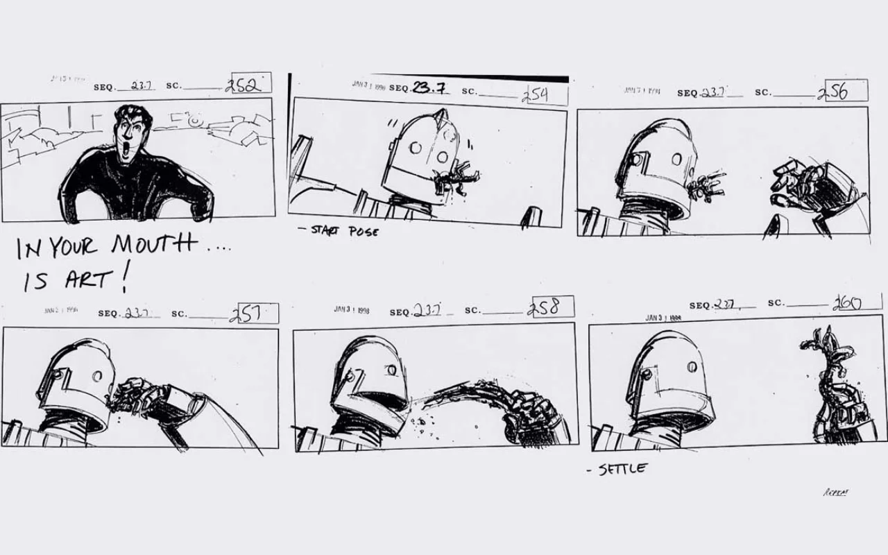
- storyboard
- visualise narrative and how elements move/change
- sketch relationship between frames
- plan for continuity
- determine pace for action to unfold
- decide which frame holds more importance
- increase drama/impact by adding a slow/quiet scene before or after a fast/loud scene
- HIERARCHY
- establish hierarchy of content presented
- ex. several levels of headlines/text/caption – leads the viewer's eye
- use size, colour and weight of typeface to determine importance
- words set at the top/left of a page are usually read first
- elements are said to have birth, life and death
- TIME
- order of type can indicate significance
- often perceive appearing first or last as most important
- BEHAVIOUR
- speed and juxtaposition of elements with sound
- affects amount of attention given by viewers
- fast/slow motion interrupting established pace is considered more significant
- sound/music add emphasis to type entering a frame
- music builds in volume/intensity, more importance





Comments
Post a Comment