
–––
23/09/2024 - 28/10/2024 (Week 1 - Week 5)
Irdhina binti Mazli Sham (0366894)
Typography - Bachelor of Design in Creative Media - Taylors University
Task 2 Typographic Exploration and Communication
TABLE OF CONTENTS:
- Lectures
- Instructions
- Process Work
- Research
- Ideation
- Final Outcome
- Feedback
- Reflection
- Further Reading
Refer to
TYPOGRAPHY TASK 1
INSTRUCTIONS
Module Information
PROCESS WORK
RESEARCH
Out of the three given headlines, I decided to proceed with
the role of Bauhaus thought on modern culture because of the
Bauhaus style itself which prioritises form following function and
less is more.
Since Bauhaus also consists of simple shapes, I thought of using those
shapes to create the letters themselves. I decided to use this accompanied
with increased size for emphasised words in some of the designs. Based on
the headline, I can safely say the emphasised words are
Bauhaus and Modern Culture.
%20on%20X.jpeg)
|
|
Fig. 1.1. Design by Louise Fili (Twt/X) |

|
|
Fig. 1.2. Design by Marko Jovanovac |

|
|
Fig. 1.3. Design by MarySabell (Dribbble) |
IDEATION
Based on the previous research, I decided to do messy sketches of
compositions with empty boxes as text replacement to better understand the
desired proportions.
SKETCHES:

|
|
Fig. 2.1. Sketch compilation (1) |

|
|
Fig. 2.2. Sketch compilation (2) |

|
|
Fig. 2.3. Sketch compilation (3) |
Afterwards, I started digitising with advice from Mr. Max. I played around
with curves and line extensions followed by a simpler approach for the
last few designs. Since a minimum of four designs were needed for
digitisation, I decided to design for different placements and proportions
which led to seven composition on InDesign.

|
| Fig. 2.4. Progress screenshot (11.11.2024) |

|
| Fig. 2.5. Progress screenshot (11.11.2024) |

|
| Fig. 2.6. Progress screenshot (11.11.2024) |

|
| Fig. 2.7. Progress screenshot (11.11.2024) |
Once I was satisfied with all the designs and transferred them to
InDesign, I proceeded with blocking each design by putting a
lowered-opacity version of the designs on a separate canvas and locking
the layer to easily trace using the Marque tool.

|
| Fig. 2.8. Progress screenshot (12.11.2024) |

|
|
Fig. 2.9. Digitisation compilation |
BLOCKING:

|
|
Fig. 2.10. Blocking compilation |
FINAL OUTCOME
FINAL TEXT FORMATTING LAYOUT
HEAD LINE
Fonts: Gill Sans Std Regular, Gill Sans Std Bold
BODY
Typeface: Gill Sans Std
Font/s: Gill Sans Std Regular
Type Size/s: 12 pt
Leading: 13 pt
Paragraph spacing: 13 pt
Characters per-line: 47
Alignment: left justified
Margins: 97mm top, 10mm bottom, 0mm left + right
Column: 2
Gutter: 8 mm

|
|
Fig. 3.1. Final composition without grids |
.jpg) | |
|
FEEDBACK
Week 6: Nine designs for I am Helvetica were shown to Mr Max with minor adjustments made to the width of an image or textbox. Four designs for a headline (The role of Haubaus thought on modern culture) was then made with three of mine approved.
Week 7:
General Feedback: Digitisation of three designs was made with several adjustments done as per Mr. Max's advice.
Specific Feedback: Mr. Max advised I avoid using split elements of black and white, especially splitting colour of text. One more design needs to be confirmed and digitised.
Week 8: Final composition chosen.
REFLECTION
EXPERIENCE: This assignment was a lot harder to come up with ideas than I initially thought. It essentially combines everything we have learnt in Task 1 and while it was an interesting work, I had trouble coming up with designs beyond using shapes as letters and applying line extension. While I am not satisfied with the final design chosen as I feel it is too simple, I have definitely improved bit by bit by the end of the task.
OBSERVATION: For this assignment, I tried to get feedback from not only Mr. Max and close classmates but also my family in terms of readability. Based on feedback and improvements, I found that certain letters are harder to adapt to Haubaus compared to others. One of such is the letter 'S' since it consists of mostly curves which made it hard for me to manually and consistently adjust attributes such as thickness once the letter is converted to a shape.
FINDINGS: I find it is easier to come up with a design with highlighted words in mind that give an actual theme to the entire phrase. From this, I learn to avoid focusing on every word in the headline individually, instead using design itself as a way to emphasise a certain keyword.
FURTHER READING
Video Game Typography Part II: Art Direction
PERIOD SETTING ART DIRECTION [Company of Heroes 2]
-
Game is set in World War II
- quite common setting – over 100 WW2 themed titles on Wikipedia
- usually first-person shooters
- LOADING SCREEN:
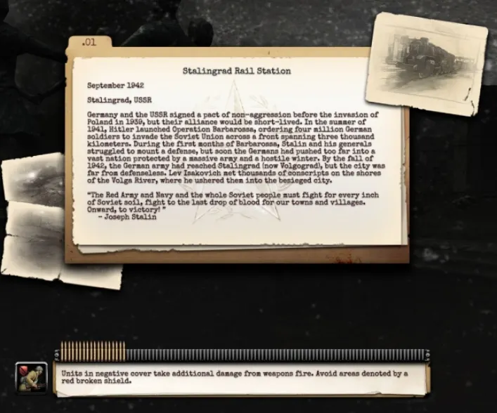
|
|
Fig. 4.1. Loading screen of Company of Heroes 2 |
- TYPEFACE: HERMES
- used in many newspapers/publications in 1940s
- used almost exclusively by typewriter machines and printers of the day
- used by the military to create mission briefings and other military documents
- use of Hermes typeface helps establish time period (1940s) – without relying on game world
DIEGETIC ART DIRECTION [LA Noire]
- Diegetic: part of a scene
- Players need to write down relevant information (clues, alibis etc)
- typography used for notes has a pencil style (uniqueness)
- helps player recall information written
- **clues can be edited down by game writer
- when displayed side by side with the typeface, comes other context (potential lies/misinformation)
- subtle use of typography has effect on how players interpret information

|
|
Fig. 4.2. Player's notebook in LA Noire |
- Flyers/business cards players interact with have authentic period lettering
- helps set the scene
|
|
Fig. 4.3. Documents from LA Noire |
- Beginning of each case also has its own name and title sequence
- similar to noir films of the 1940s
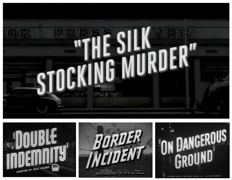
|
|
Fig. 4.4. LA Noire's case title sequence (top) compared to actual noir films title sequences (bottom) |
Comments
Post a Comment