–––
23/09/2024 - 28/10/2024 (Week 1 - Week 5)
Irdhina binti Mazli Sham (0366894)
Typography - Bachelor of Design in Creative Media - Taylors University
Task 2 Type Design and Communication
TABLE OF CONTENTS:
- Lectures
- Instructions
- Process Work
- Research
- Ideation
- Final Outcome
- Feedback
- Reflection
- Further Reading
Refer to TYPOGRAPHY TASK 1
INSTRUCTIONS
Module Information
PROCESS WORK
RESEARCH
When it comes to research, I tried finding thicker designs and ended up
finding some with good contrast of thick and thin. My initial idea was to
go for calligraphy but after the references, I decided to explore more on
separating strokes and using shapes to create the letters without falling
into the category of adding things to the font.

|
|
Fig. 1.1. Design by TRÜF |

|
|
Fig. 1.2. Design by TRÜF |

|
|
|
LETTERS/SYMBOLS: o l e d s n c h t i g , . ! #
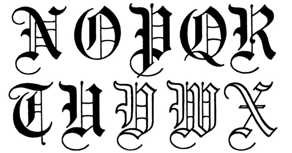
Aside from the previous idea, I also delved into Old English writing
style and in the end, the chosen design would somewhat be a combination of
these two ideas.
|
|
|
IDEATION
SKETCHES:
Based on the inspiration, I tried to sketch a few designs that are more
playful followed by some that are more rigid. One of the sketch idea was
to have the lowercase letterform be an incomplete version of its capital counterpart. Unfortunately, the twist and turns of
the design made its readability low, which caused me to not use it as a
finalised work as it would be hard to digitise, not to mention not meeting
the criteria. These designs were made by either a flat-tip pen, ball pen
or a brush pen.

|
|
|
I tried to remake the sketches with a better idea for their
proportions based on what was accepted by Mr. Max. Final decision on
typeface is boxed in green.

|
| Fig. 2.2. Compilation of design sketches [refined] |
DIGITISATION:
Before digitising, Mr. Max showed us a tutorial on dissecting a letter
using lines and circles to accurately have results. This was my attempt
following the tutorial.

|
|
Fig. 2.3. Dissection of the letter 'm' |
I started by uploading a photo of the traditional sketch onto a new canvas
with low opacity. To make the process easier, the first letter I made was
the 'o' as it would later be used as a base for other letters such as
g, d and even s as well as c.

|
| Fig. 2.4. Progress screenshot (Illustrator) |
The letters are then transferred to another canvas where the base,
x-height, ascender and descender were already set based on the closest
typeface available.

|
| Fig. 2.5. Progress screenshot (Illustrator) |
Aside from letters, Mr. Max also taught us how to accurately draw
the comma and period so it would not look out of place when typed
out. I tried to do a standard design but he advised I use part of
the exclamation mark as the period and go from there for the
comma.

|
| Fig. 2.6. Progress screenshot (Illustrator) |
Certain letters even ended up with several designs where I had Mr. Max
choose which would be the most suitable. These letters include
s, c, t, g, l and even symbols such as '.', ',' and
'#'.

|
| Fig. 2.7. Progress screenshot (Illustrator) |

|
|
Fig. 2.8. Multiple designs for period and comma |

|
|
Fig. 2.9. Multiple designs for letter 't' and hashtag |
APPLICATION TO FONTLAB:
Once everything was done to satisfactory, the designs are then
transferred to FontLab. It took me a while to get used to it since
the amount of functions available seemed intimidating at
first.

|
|
Fig. 2.10. Progress screenshot (FontLab) |

|
|
|

|
|
|

|
|
Fig. 2.13. Side-bearings for each letter |

|
|
Fig. 2.14. Kerning values |
TYPOGRAPHIC POSTER:
While coming up with a quote to use, I noticed the typeface and
letters given spell out 'ghost' and 'dog' quite nicely. Using these
two words, I ended up with a variation of a ghost seeing its old
dog. I played around with the wording as well as placement before
coming to a close. The black background with white text would also
fit the theme, particularly for the word 'ghost'.

|
||
|

|
||
|
The final design has the quote in a slanting position and I tried
using two methods to see which would align better.

|
||
|

|
||
|
In the end, I ended up with the third composition except I changed cold to old and added #nice! to complete the requirement.

|
||
|
However, Mr. Max told us while we were required to use all the
letters, it is not necessarily the case for symbols. Using this
information, I decided to change the quote to
the old ghost, seeing its cold old dog. I arranged the
placement and made it centre to form an upside down
triangle.

|
|
|
EXTRA LETTERS:
I thought of doing extra letters to spell out several character
names including merlin, vi, morgana and ekko as
well as a few of my friends' names while we were messing around
with the designs. Eventually, I decided to design the rest of the letters except for x and z due to limited time.

|
|
|

|
|
|
While doing the extra letters, I figured out a way to redesign
h and n to make them blend in more with the
other letters.
 |
| Fig. 2.23. New design for h and n |
 |
Fig. 2.24. New kerning (required letters) |
FINAL OUTCOME
Download the font:
Oz (Both Regular and Extra Letters)

|
|
Fig. 3.1. Final type construction |

|
|
Fig. 3.2. Final type poster |
EXTRA SUBMISSION:

|
|
Fig. 3.3. Final type construction (extra letters) |

|
|
Fig. 3.4. Final type poster (some of the extra letters) |
FEEDBACK
Week 9:
General Feedback: Mr. Max briefed us about the following
task. 9 sketches of bogh BOGH in different styles
are needed to be shown by next week.
Specific Feedback: I showed a practice design and was able
to proceed but Mr. Max suggested I avoid sharp edges for h to
better fit the typeface.
Week 10:
General Feedback: I showed Mr. Max several sketches using
the three pens and had some simple designs approved.
Specific Feedback: He advised I avoid the complicated
designs because while the design is there, it can be quite hard to
read.
Week 11: I showed the digitisation with more choices for
certain letters. Mr. Max chose the designs that would be cohesive
together. I can now proceed with kerning and poster-making.
Week 12: I finished the required submission and continued doing extra
letters. I also started compiling previous assignments for task
4.
Week 13: Assignment completed.
REFLECTION
Experience: This
assignment was overall very fun, it is actually one of the
assignments that I was looking forward to for degree when I first
heard of it from a friend. The use of traditional media to design
the typefaces before digitisation made it nicer because this is one
of the few projects in Semester 1 that did not rely fully on digital
media, which is a breath of fresh air.
Observation: The
feedback from Mr. Max usually does not stray far from the original
concept I had in mind when designing the typeface. He is very
helpful when it comes to giving tips on how to digitise certain
letters with his tutorials, which made my digitising process a lot
easier. Moreover, feedback from friends also helped me proceed with
the assignment since they are also design students, which makes it
easier to present the concepts as well.
Findings: References
on Pinterest help a lot when it comes to designing your own
typeface, especially when you have a wide variety. It takes a lot
more to design something aside from making it look pretty, and this
includes typefaces since you need to consider the anatomy and
proportions as well as readability and flow.
FURTHER READING
Typography Art: What Is It & Best Examples to Get
Inspired
What is Typography Art?
- Also known as typographic art or type-based art
- artistic arrangement of typefaces and fonts to create images
- prioritises creativity and aesthetics
Elements of Typography Art
- Font Selection and Manipulation
- experiment with different combinations of typefaces
- play around with font size, line/letter spacing and letterforms to create visual interest
- Layout and Composition
- consider placement/hierarchy to achieve balanced and visually appealing compositions
- add depth and complexity to design using various methods (ex. negative space)
- Colour and Texture
- Colour add visual interest and convey emotions
- convey specific feeling/atmosphere
- Texture adds depth – visually engaging
Different Styles of Typography Art
- Minimalist
- Playful
- Kinetic
- 3D Typography
- Lettering as Illustration
Comments
Post a Comment