
|
| Fig. 1. BMO from Adventure Time (S6 Ep10) |
DESIGN PRINCIPLES (TASK 1): EXPLORATION
–––
03/02/2025 - 17/02/2025 (Week 1 - Week 3)
Irdhina binti
Mazli Sham (0366894)
Design Principles - Bachelor of Design in Creative
Media - Taylors University
Task 1 Exploration
TABLE OF CONTENTS:
LECTURES
VISUAL COMMUNICATION
- utilising design to convey messages
- well thought-out and executed
- effective: apply elements and principles of design
- ELEMENTS OF DESIGN – individual building blocks
- Point
- simplest element
- if used as repetitive mark – forms a line
- as point moves in space, other figures/forms are created
- Line
- active/static, aggressive/passive, sensual/mechanical
- indicate directions, boundaries (shape/space), volume/solid masses, motion, emotion
- grouped to depict quality of line/shadow or form patterns/textures
- Shape
- expanse within the outline of 2D area/3D object
- visible when lines enclose an area or change in value/colour/texture setting an area apart
- geometric/organic
- geometric – precise and regular
- organic – irregular, curved, informal
- Form
- 3D area
- when encloses space, it is called volume
- major element in sculpture and architecture
- form implied in 2D media (use light/shadow)
- Texture
- tactile quality or its visual representation
- all surfaces have texture – touched or visual suggestion
- actual/simulated (touch) or implied (visual)
- Space
- indefinable, general receptacle of all things
- in 2D media, we see space of the surface all at once
- defined by its edges (height/width)
- can be infinite spacial qualities within limited boundaries
- 3D space is experienced when we are in it
- outside (mass), inside (volume)
- Graphic design: area that a shape/form occupies
- positive (filled) or negative (empty)
- illusion of 3D space achieved through depth
- overlapping images, size variation, placement, perspective
- Colour
- visual byproduct of light spectrum
- light wavelengths received and processed from a reflected source
- hue, value, saturation/intensity
- hue: colour of spectrum
- value: lightness/darkness from white-grey-black
- tint: hue + white
- tone: hue + grey
- shade: hue + black
- saturation/intensity: purity of a hue
- pure hue: most intense (highest saturation and brightest form)
- intensity diminishes when pigment (black/grey/white) of another hue is added
- colour schemes: monochromatic, analogous, complementary
- monochromatic: variation in value/intensity of a single hue
- analogous: adjacent colours, same pure hue
- complementary: two hues directly opposite on colour wheel
- PRINCIPLES OF DESIGN – fundamentals guiding element arrangement
- Contrast
- juxtaposition of strongly dissimilar elements
- without contrast – monotonous visual experience
- provide visual interest, emphasise point, express content
- Gestalt Theory

|
| Fig. 2. Gestalt Theory from Rethinking the Future |
- human brain wired to see patterns, logic, structure
- GESTALT – shape/form in German
- rules how human eye perceive visual elements
- how complex scenes can be reduced to simple shapes
- explain how the eyes perceive shapes as a single, united form rather than separate elements
- PRINCIPLE OF SIMILARITY – perception of similar elements as complete even when separated
- brain crafts link between similar elements
- PRINCIPLE OF CONTINUATION – eye follows path/line/curves of a design (continuous flow)
- PRINCIPLE OF CLOSURE – seeing complete shapes even when elements are incomplete by filling in missing vital information
- PRINCIPLE OF PROXIMITY – ensuring related design elements are placed together
- close proximity: connected
- give structure
- PRINCIPLE OF FIGURE-GROUND – items perceived being in foreground/background
- LAW OF SYMMETRY AND ORDER – elements symmetrical with each other tend to be perceived as a united group
- EXTRA: Law of Uniform Connectedness, Law of Prägnanz, Law of Common Fate
- Balance
- distribution of visual weight
- visual equilibrium
- symmetrical: equal weight on equal side
- either side on central axis creates bilateral balance
- around a centre point creates radial balance
- approximate symmetry: equivalent but not identical forms arranged around the fulcrum line
- asymmetrical: unequal visual weight
- one side contains dominant element, balanced by a couple or more lesser focal points on the other side
- more dynamic and interesting
- evokes feelings of modernism, movement, energy, vitality
- offer visual variety
- THE GOLDEN RATIO (phi) – mathematical concept and a number that goes on infinitely (1.61803...)
- comes from the Fibonacci sequence
- found everywhere (ex. shape of seashell)
- representative of perfect beauty
- guide to create visual balance
- brings harmony, balance, structure
- RULE OF THIRDS – composition guideline for dynamism
- divided evenly into thirds horizontally and vertically
- subject placed on intersection or on the line itself
- Emphasis
- create dominance and focus
- achieved through shapes/colour/value
- Repetition
- exist all around
- make design seem active
- create rhythm and pattern
- variety (slight change/difference) is essential to avoid monotony
- pattern increases visual excitement (enrich surface interest)
- Movement
- leads the eye in, around and through a composition
- occurs when objects seem to be moving in a visual image
- comes from shapes/forms/lines/curves
- HIERARCHY – choreography of content to communicate information and convey content
- directs viewer to most important information and navigate through secondary content
- ALIGNMENT – edges line up along common rows/columns/centre
- sense of unity/cohesion, perceived stability
- leads person through a design
- Harmony
- selection of elements with common traits
- becomes monotony without variety
- sense of all elements in a design fit together (theme/aesthetic/mood)
- UNITY – repetition of particular elements (colours/shapes/materials) to pull the look together
- gives a sense of oneness
- SCALE AND PROPORTION – have to do with size
- SCALE: size of one object in relation to the other objects
- actual measurement or visual estimates
- ex. architectural drawings
- used to specify/illustrate details based on relative size of objects
- deviation from normal scale relationship creates dramatic result and visual interest
- PROPORTION: parts of an object in relationship to other parts of the same object
- relationship of 2+ elements in a composition and how they compare to one another (ratio)
- harmonious when done correctly
- Symbol
- sign/shape/object used to represent something else
- provide information, equivalent to one or more sentences of text/story
- FIGURATIVE
- VISUAL
- GRAPHIC
- PICTORIAL
- simplified pictures (image-related)
- ABSTRACT
- less details than what they represent (ex. bathroom signs)
- ARBITRARY
- no resemblance to what they represent
- many based on geometric shapes and colours
- need to learn
- NON-FIGURATIVE
- Word and Image
- able to relate to a concept/brand when using the right images
- important to use suitable/relevant images in design
- right words to pair with images to deepen meaning
- suitable typeface and positioning create hierarchy and balance
INSTRUCTIONS
TASK 1
Gestalt Theory
|
|
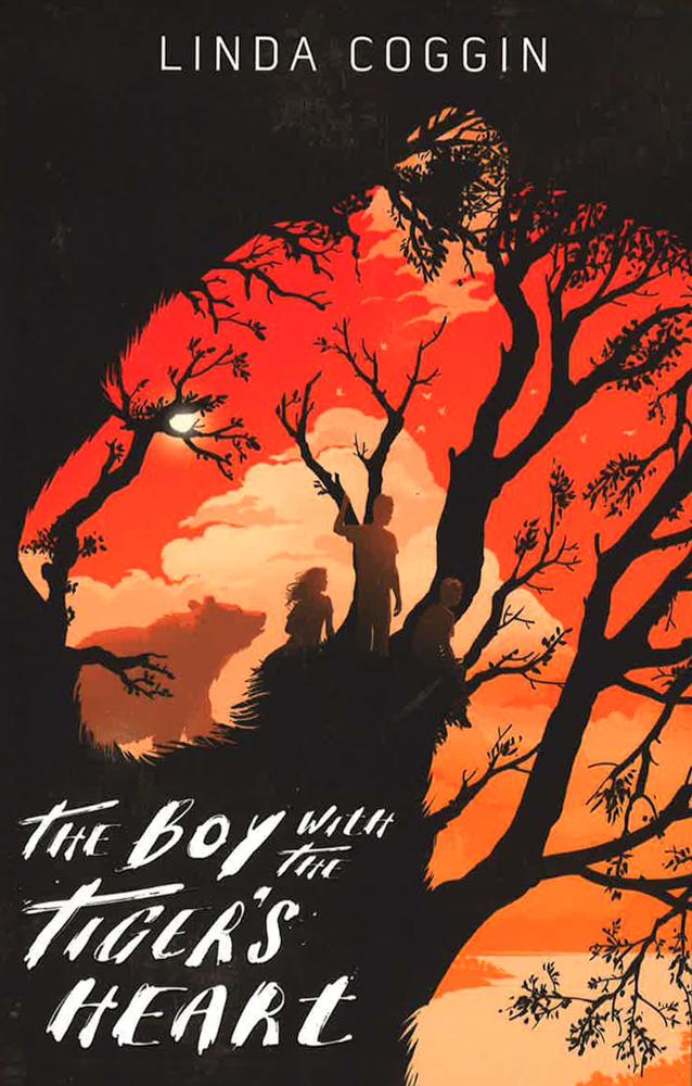
Fig. 3. Book cover of The Boy with the Tiger's Heart by
Linda Coggin (2014) Illustrated by
Levente Szabó |
 |
| Fig. 4. Annotations for Gestalt Theory example |
Gestalt Theory plays with the notion of humans seeing
patterns/logic/structure by reducing complicated form to simpler shapes.
In the cover shown, viewers would see a tiger at first glance followed
by a scenery with three character when looked closely. It has clever use
of associating an element from one structure to a different element from
another (ex. branches being used as the tiger's stripes). This is considered to be under multistability, also known as Principle of Figure-Ground, which is when we tend to perceive objects in relation to their surroundings.
Contrast

|
| Fig. 5. Cover for Hamra and the Jungle of Memories (story by Hanna Alkaf) illustrated by Deb JJ Lee (2022) |
 |
| Fig. 6. Annotations for Contrast example |
Contrast is the juxtaposition of dissimilar elements, either through
colours, size or nature of the element itself. In this cover, contrast is
shown through complementary colours between the tiger/human (orange) and
background (green). Contrast is also shown through the difference in size
between the tiger and the human.
Balance
|
| Fig. 7. Artwork by Matteo Bassini (2020) – Digital Illustration |
 |
| Fig. 8. Annotations for Balance example |
Balance is distribution of visual weight and it can be categorised into
symmetric, asymmetric or radial balance. In Bassini's artwork, there is a
near symmetrical balance with the general position of the middle tall
subject acting as a vertical axis for the composition.
Emphasis
|
|
Fig. 9. Birth of Mr. Misang by
Mr. Misang (2016)
– Digital Illustration |
 |
| Fig. 10. Annotations for Emphasis example |
Emphasis is shown through shape/colour/value to create dominance and focus.
The difference in colour here emphasises the main subject not only through
the complementary colours of him and the rest, but also how the main subject
himself contains a higher variety of colours with different values compared
to the rest. Other characters looking his way also help emphasise his
presence in the artwork.
Repetition

|
|
Fig. 11. Little Houses Poster by Miguel Herranz (2008) – Watercolour |
 |
| Fig. 12. Annotations for Repetition example |
Repetition consists of the same elements being seen multiple times in the
same composition to create visual excitement. In Herranz's artwork, the
same element repeated is a house with variety added by changing the
rotation of each house to avoid monotony. The three-dimensional form of
the houses also add depth to the artwork.
Movement

|
| Fig. 13. Art for The Casserole (story by Thomas McGuane) illustrated by Victo Ngai (2013) – Digital Illustration |
 |
| Fig. 14. Annotations for Movement example |
Movement happens when an element(s) is seen as if moving in a still
design/artwork. It helps the the artwork become more interesting by
leading the eye in and through the composition as shown in the
illustration above. The direction of the birds along with their increasing
size from top to bottom gives illusion of them moving closer to the
viewer.
Harmony

|
| Fig. 15. Artwork by Shimarisu Yukichi (2023) – Digital Illustration |
 |
| Fig. 16. Annotations for Harmony example |
Harmony consists multiple elements of similar nature fitting together in a
single design. This artwork not only uses analogous colours with its blues
and greens (as well as some yellow), it also uses elements of two different
themes and combining them together in a way that makes the entire design
look cohesive.
Symbol

|
| Fig. 17. Homer by Tyler Miles Lockett (2022) – Digital Illustration |
 |
| Fig. 18. Annotations for Symbol example |
Symbols are used to represent something either directly or otherwise through the use of signs, objects or shapes. In the chosen artwork, pictorial symbols are shown in the night sky to replace constellations and give context to the overall situation. This, accompanied with the instrument and campfire as well as the group of people together suggests an activity of storytelling. According to the symbols themselves, it shows further context of the storyteller (Homer based on the title) is retelling myths from Ancient Greece.
Word and Image

|
| Fig. 19. Comic panel from Spider-Punk #2 (2022) illustrated by Justin Mason and Jim Charalampidis |
 |
| Fig. 20. Annotations for Word-Image example |
Relationship between word and image is important for a more significant
impact. A good example of this application is in onomatopoeia in comics
where the artist adjusts the font and size of words to suit the graphic, as
shown in Spider-Punk #2.

|
| Fig. 21. Artwork by Gustavo Arteaga |
Title: Shattered Utopia
Artist Name: Gustavo Arteaga
Year: 2017
Size: 1920px x 3408px
Medium: Digital Illustration
Reason for chosen artwork:
Character art has piqued my interest and Shattered Utopia was coincidentally made in 2017, which was also around the time I
started doing digital art. I like how people are able to interpret their
own story involving characters and even different worlds into an artwork
that depicts the essence of that creativity, which is essentially what is
done with this artwork.
I admire the overall composition in terms of how the focus is shown through not only the glass pieces all pointing towards the middle, but also through the circular structures decreasing in size as they fade in the background. The contrasting colours of warm and cool tones based on the shards' placement really makes the drawing pop while also giving context clues to the character's story. The clever use of decreasing colour contrast from foreground to background also adds more depth. Aside from the design principles present, I like the mix of fantasy and adventure theme of this artwork as seen from the elements in background and the ragged look of the character.
Design Principles:
 |
| Fig. 22. Annotations for chosen artwork |
- Gestalt Theory
- Principle of Closure
- structures in the background can be seen as complete circles despite being incomplete
- Principle of Figure Ground
- clear element placement for foreground, middle ground and background
- elements on foreground creates framing
- character placed on middle ground
- Contrast
- colour contrast between background seen without glass (warm) and through the glass (cool)
- higher contrast when object is near the viewer, decreasing as it fades in the background
- Movement
- leads the eye in to the focus through the overall direction of broken/cracked/shattered glass and decreasing size of circular structures
- [EXTRA] Emphasis
- glass pieces and hand position puts more focus on focal point
FEEDBACK
Week 1:
General Feedback: Introduction to Design Principles was
done with general instructions for tasks given. Created a new label
for Design Principle and made lecture notes as well as providing the
needed photos/artworks.
Week 2:
General Feedback: Mr. Vinod checked blog progress.
Proceed with reason for artwork selection and identify the
principles.
Specific Feedback: Reorganise the blog structure (Lecture
first then Instructions) and change Module Information/Process
Work to Instruction/Task 1.
Week 3:
General Feedback: Completed reason for chosen artwork and listed design principles with visual annotations. Proceed with reflection.
Specific Feedback: Add emphasis to chosen artwork alongside movement and contrast.
REFLECTION
Experience: Design Principles, from a first glance, might seem simple since it is part of not only this degree but also Foundation in Design. The first "encounter" I had with design principles in tertiary studies was actually in Design Basics and it was fun to learn it now where the module goes in depth for each principle and how they can be applied in different ways. So far, it seems to be one of the least challenging modules in this semester, at least for the first task but reading the module information, I can certainly say there is more to come and I'm looking forward to it!
Observation: Since I'm placed in the earlier slots, this gave me a chance to not only receive consultation early but it allows me to listen to the feedback Mr. Vinod gives to other students, some of which are applicable enough for me to alter my work.
Findings: When searching for the artworks to showcase each principle, I noticed quite a lot that managed to balance between two or even more different principles, which I found was impressive. This is especially true when there are evidence of experimentation because it shows how knowledgeable the artist is in the fundamentals of art and design accompanied with their own creativity.
Comments
Post a Comment