
|
| Fig. 1. Peppermint Butler from the fourth episode of Adventure Time: Distant Lands (Wizard City) |
DESIGN PRINCIPLES (TASK 2): VISUAL ANALYSIS AND IDEATION
–––
17/02/2025 - 03/03/2025 (Week 1 - Week 3)
Irdhina binti
Mazli Sham (0366894)
Design Principles - Bachelor of Design in Creative
Media - Taylors University
Task 2 Visual Analysis and Ideation
TABLE OF CONTENTS:
LECTURES
VISUAL ANALYSIS
- method to understand design focusing on visual elements/principles
- description and explanation of visual structure
- to recognise choices made in creating a design and how the formal properties of design communicates ideas, content or meaning
PHASE 1 [OBSERVATION]
- closely looking and identifying visual elements
- describe in your own words
- looking, thinking, finding good language
PHASE 2 [ANALYSIS]
- think about your observation
- identified elements combined to create design principles, completing the design – how it affects viewer
- how the eyes are led through the work and why
PHASE 3 [INTERPRETATION]
- fused with facts about the design/designer
- meaning and purpose of the design
INSTRUCTIONS
TASK 2
Recap: Recap the Task 2
brief, we need to write a 300-350 words analysis of the chosen artwork
(from Task 1) followed by three ideas on how it can be improved. Each idea
is supported by 30-50 words rationale with visual references.
Chosen Artwork [Task 1]:

|
| Fig. 2. Artwork by Gustavo Arteaga |
Title: Shattered Utopia
Artist Name: Gustavo Arteaga
Year: 2017
Size: 1920px x 3408px
Medium: Digital Illustration

|
| Fig. 3. Visual annotations for Task 2 (accompanied by Task 1 notes) |
Observation:
Shattered Utopia is drawn in
a vertical/portrait canvas. The main character has
his hand raised with pieces of glass pointing at its general direction. In the background, I noticed there is a clear cut between warm and cool tones using the glass area. Outside of the glass area, the main
colours seen range from orange to a warm purple whereas inside the glass, several tones of blues and some green are seen. I also observed the elements drawn are also a mixture of both nature and manmade. The artwork looks detailed when seen from afar but the strokes are
easier to understand and interpret when I zoomed in. This artwork also
has a mixture of both lined and lineless art, depending on the
element.
(126 words)
Analysis:
The artwork has good use of design principles to create a
composition that illustrates part of a story. Its use of
contrast in not only hue but also value directs the
viewer to the top left section where the curved structure followed by
leading lines from the glass pieces would lead the eyes to the actual
focus/focal point (emphasis), which is the character. The
character, who is in a pose that helps emphasise the artwork's focus, is
drawn as a partial silhouette. This further puts a more
dramatic effect on the artwork as the background and character
have a stark contrast with each other in terms of
colour variety. This artwork creates a framing by using
the elements of the surroundings, rather than having an actual
rectangular frame. The composition of the artwork has good depth by
having
clear division of foreground, middle-ground and background (Gestalt
theory – Principle of Figure-Ground).
(144 words)
Interpretation:
Based on the composition of the overall artwork as well as the elements
themselves, I interpret the drawing to depict an
adventure-like scene. This is supported by the artist himself
whose other drawings consist of similar themes. From the
pose of the character followed by the dramatic colour difference, he seems to have made a discovery, most likely discovering
either a hidden place/reality or he finally
reached his destination. However, given the title
Shattered Utopia, I theorise that the place initially seen as
near perfect, was in shambles when the character finally
came across it.
(96 words)
Sketches (Improving Artwork)
1. AFTERMATH
The first sketch uses a similar concept of glass pieces to imply
separation but this composition shows the aftermath of the original
artwork in the most literal sense. The character is frantically trying
to "retrieve" the utopia by physically putting the broken pieces
together like a jigsaw puzzle. In terms of design principles, this
sketch uses emphasis, symbols/symbolism (pictorial) and principle of
closure. It also plays around with negative/positive space due to the
dark empty background.
 |
| Fig. 4. Sketch 1 |
 |
| Fig. 5. Sketch 1 visual annotations |
References
This sketch focuses around puzzles, specifically jigsaw puzzles and assembling them to form a portal to the desired location. The closest thing I could think of with this was Minecraft, where a portal would be built with specific blocks and fire.
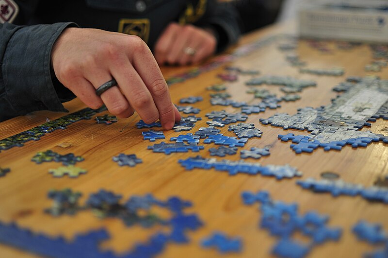 |
| Fig. 6. Jigsaw Puzzle from [source] |
![[source]](https://commons.wikimedia.org/wiki/Jigsaw_puzzle#/media/File:Jigsaw_puzzle_01_by_Scouten.jpg)
 |
| Fig. 7. Ender Portal from Minecraft |
2. REALISATION
The second sketch has leading lines and movement towards the focal
point that is placed on the artwork using Rule of Thirds. Aside from
the aforementioned principles, this sketch also uses Gestalt theory,
specifically principle of Figure-Ground and Closure. In this
composition, the character gradually realises the current state of
his utopia as he goes up the rough platform. As he starts from the
bottom, the glass looks complete only for it to shatter at the top,
revealing the actual state of his destination. This can also act as
the predecessor of the original artwork.
 |
| Fig. 8. Sketch 2 |
 |
| Fig. 9. Sketch 2 visual annotations |
References
I wanted to capture a feeling of disbelief and despair in the character after going through the hardship of finding the utopia in the first place. A similar feeling to this, while different, would be the scene of Caesar (Rise of the Planet of the Apes) reaching up to the sky during his captivity only to realise it was merely a painted wall, created to simulate the wide wilderness.
 |
| Fig. 10. Poster of the Rise of the Planet of the Apes from IMDB |
The last sketch reverses the nature of elements drawn in the original
artwork. It plays around with balance, Gestalt theory (Principle of
Closure and Figure-Ground) and how it changes the original narrative.
The sketch has a similar vibe to stories with non-living beings as the
protagonist (ex. Toy Story), adding a spin to the original artwork.
 |
| Fig. 11. Sketch 3 |
 |
| Fig. 12. Sketch 3 visual annotations |
References
I wanted to do a complete 180º take on the original artwork in a literal sense. The elements I took were specifically the glass pieces and the character. A similar concept/story to this would be the Wild Robot where Roz (a robot) starts out of her element by being surrounded by nature. The giant hands drawn was also partially inspired by the end credit scene from Steven Universe.
 |
| Fig. 13. Scene from The Wild Robot |
 |
| Fig. 14. End credit from Steven Universe |
FEEDBACK
Week 4:
General Feedback: Progress for observation, analysis and
interpretation checked.
Specific Feedback: Use "I observe/notice" in observation.
Week 5:
General Feedback: Misunderstood the MIB "improve artwork"
instruction, redo the three sketches (done)
Specific Feedback: Let the ideas marinate and expand more on each
sketch.
REFLECTION
EXPERIENCE: For this assignment, I learned more about what is considered an
observation, analysis and interpretation of an artwork. Before taking
this module, I tended to mix everything together and would have
trouble categorising them into those three writings. As for the second
part of the task (sketch), I got it wrong at first as I thought it was
based on the principles we observed and analysed from the original
artwork. Overall aside from the misunderstanding, I am satisfied with
the three sketches made, especially the second and third
composition.
OBSERVATION: I managed to find a way to access Art Station to get the original
post by the artist only to find out they put little to no detail of
what the artwork is actually about. While it was challenging with
little background details, I did make it work using my own
interpretation based on what I know when it comes to things like
colour theory and symbolism as well as context clues. While I'm not as
comfortable with the idea of 'improving' someone else's work out of
respect for the original artist, I tried to make it work by playing
around with the elements and narrative.
FINDINGS: When doing observation, analysis and interpretation, I had to look
closely on the artwork and search for meanings of different things
including shape language and colour. I also find that each tutor has
their own way of teaching because when I referred to my friends'
blogs, each of them has a different approach to the same task
according to their respective tutors.
Comments
Post a Comment